

Responsive Web Design with HTML5 and CSS: Build future-proof responsive websites using the latest HTML5 and CSS techniques.
This book emphasizes pragmatic application, teaching you the approaches needed to build most real-life websites, with downloadable examples in every chapter.
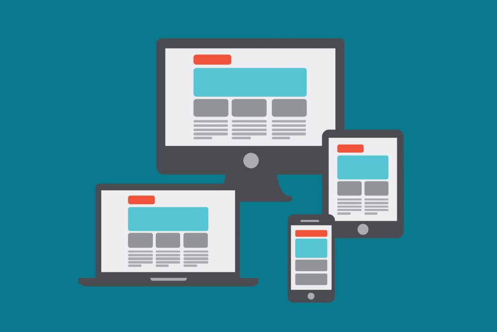
Responsive web design is an approach to creating websites that ensures that the site is easily viewable and usable on a wide range of devices with different screen sizes and resolutions, including desktop computers, laptops, tablets, and smartphones. The design is responsive because it adjusts to the screen size and orientation of the device on which it is viewed, so the user can access the content and navigate the site easily.
In responsive web design, the layout, content, and images of a website are coded to be fluid and flexible. This means that the website will adjust its appearance to fit the screen size of the device on which it is viewed, and the content will be rearranged and resized automatically to optimize the user experience.
Responsive web design is important because it ensures that users have a consistent and enjoyable experience on a website, regardless of the device they use to access it. With more and more people using mobile devices to browse the internet, responsive design has become essential for creating a successful website.
To learn more about the technical architecture of responsive web design please visit the Mozilla Developer Network here.