
Mobile devices have become an essential part of our lives, and with the increasing number of users accessing the internet on their smartphones, it’s no surprise that mobile-first web design has become a popular approach for building websites. Mobile-first design is the practice of designing websites for mobile devices first, then adapting the design to larger screens like desktops and laptops.
In the past, designers used to create websites for desktops and then try to optimize the design for mobile devices. However, with the rapid growth of mobile users, this approach is no longer practical. Mobile-first design takes into account the constraints of smaller screens, slower connections, and touch-based interactions that mobile users face. It’s a strategy that puts the user’s experience first, ensuring that the website is optimized for mobile users before considering desktop users.
The Benefits of Mobile-First Web Design
One of the biggest benefits of mobile-first web design is that it ensures that the website is designed with the user in mind. With mobile devices, users have limited screen space, and they often use touch-based gestures to interact with the website. Mobile-first design takes these factors into account, providing a better user experience for mobile users.
Another benefit of mobile-first design is that it helps improve website performance. By designing a website for mobile devices first, designers can prioritize the content that’s most important to the user. This means that the website can load faster, and users can access the information they need quickly.
Mobile-first design also encourages designers to think more critically about the content they include on the website. With limited screen space, designers have to make tough decisions about what content to include and what to leave out. This forces designers to focus on the most important content, resulting in a cleaner and more focused website.
Best Practices for Mobile-First Web Design
Mobile-first web design requires a different approach than traditional web design. Here are some best practices to consider when designing for mobile devices:
-
Design for touch-based interactions: Mobile users interact with websites using touch-based gestures like swiping and tapping. Designers need to consider these gestures when designing for mobile devices.
-
Use a simple and focused layout: With limited screen space, designers need to keep the layout simple and focused. Use a single column layout, prioritize content, and avoid clutter.
-
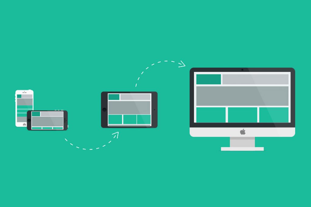
Use responsive design: Responsive design allows the website to adapt to different screen sizes automatically. This means that the website will look good on any device, whether it’s a smartphone, tablet, or desktop.
-
Optimize images and media: Images and media can slow down the website, especially on mobile devices. Optimize images for the web, and consider using media formats that are optimized for mobile devices.
-
Prioritize content: Designers need to prioritize content based on the user’s needs. This means that the most important content should be front and center, with less important content pushed to the bottom.
Mobile-first web design is a strategy that puts the user’s experience first. With more and more users accessing the internet on their smartphones, it’s essential that designers prioritize mobile users when designing websites. By designing for mobile devices first, designers can create websites that are optimized for mobile users, resulting in a better user experience and improved website performance.